Dashboard
The dashboard is a fixed page, not a board you assemble. It opens with what needs a decision from you, then how much has been happening, then your own work. There is no widget picker: nothing can be switched off.
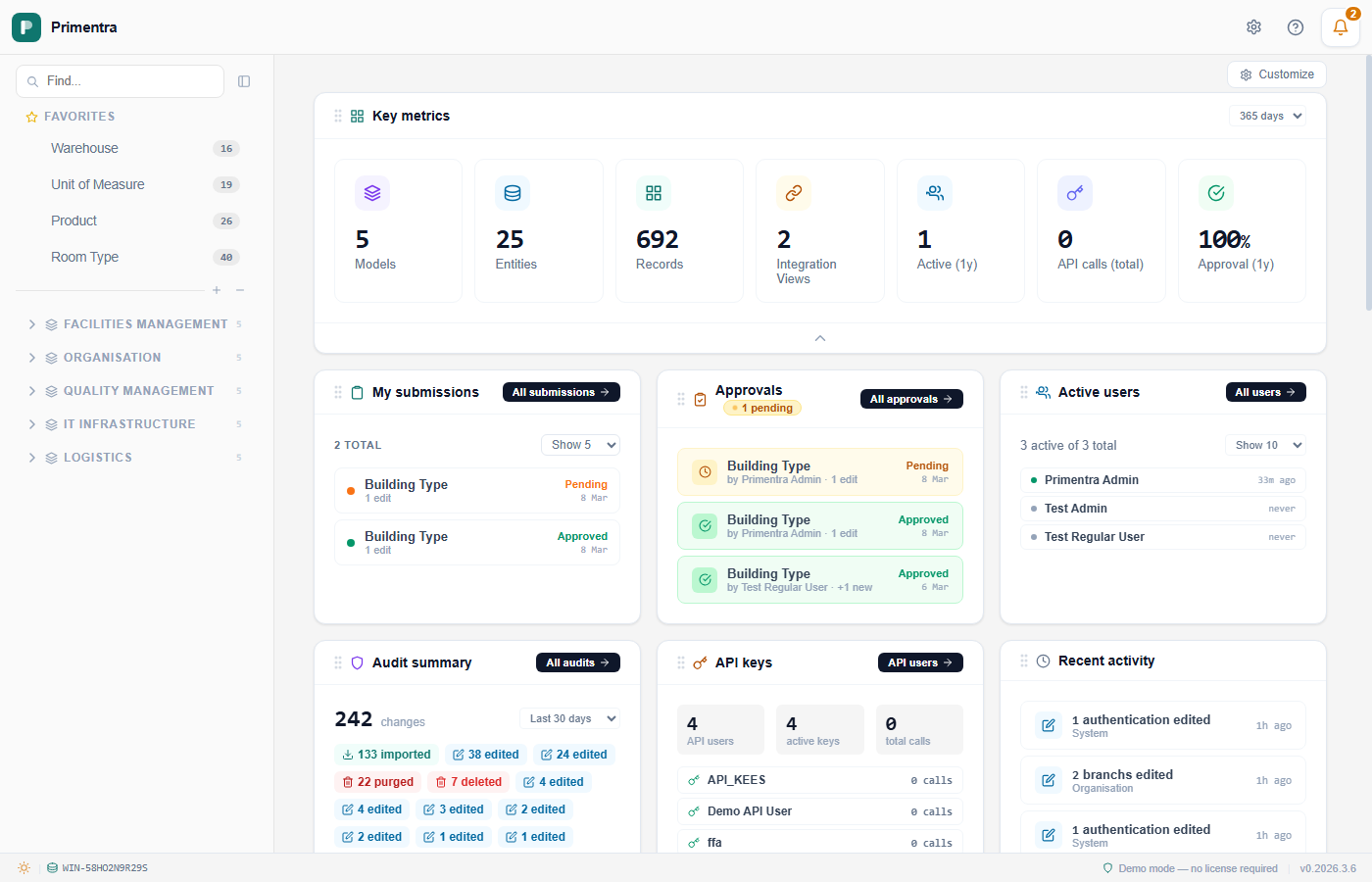
The page has three parts, always in this order:
- Needs your attention — administrators and approvers only
- System activity — a chart of what has been happening
- Your work — your submissions, the recent activity, and the admin cards
Refresh, top right, reloads all of it without a page reload.
Needs your attention
Five cards. The heading counts them: *"3 things worth a look"*, or *"All caught up"* when every card is clear. A card that is clear turns green and says so, so the row means the same thing whether or not there is a problem.
| Card | Who sees it | What it counts | Button |
|---|---|---|---|
| Approvals | Approvers and administrators | Changes waiting for review | Review |
| Business rule failures | Administrators | Records that fail a validation rule, listed per entity | Fix now |
| Staging errors | Administrators | Entities with rows that failed to import, listed per entity | View details |
| Integration alerts | Administrators | Views out of sync with their source | View alerts |
| Lookalikes | Everyone | Coming soon | — |
A regular user gets no heading and no row, only the Lookalikes card on its own. There is nothing else there for them to act on.
Clicking a card opens the screen behind it. On Business rule failures and Staging errors the entity names are clickable too, and take you straight to that entity rather than to the overview.
System activity
A bar chart of the whole installation's activity, with two controls in its header.
The range. Today, Last 7 days, Last 30 days (the default), Last 90 days, Last year, or Custom range…, which adds two date fields. The axis adapts to what you picked: weekday names across a week, dates across a month or a quarter, month names across a year.
The metric. What the bars count. Administrators get 17 to choose from, approvers get 13:
- All activity
- Records created, records edited, records deleted
- Imports, purges
- Approvals submitted, approved, rejected, sent back
- Active users
- Business rule failures detected
- Staging rows rejected
Administrators get four more: Successful logins, Failed login attempts, Permission/role changes, and API key/user management events.
Your work
The cards below the chart. Which ones you see depends on your role.
| Card | Regular user | Approver | Administrator |
|---|---|---|---|
| My submissions | ✓ | ✓ | ✓ |
| Recent activity | own only | own only | all users |
| Audit summary | own only | own only | all users |
| Active users | — | — | ✓ |
| API keys | — | — | ✓ |
These are the only things you can rearrange. Drag a card by its header to move it; a teal outline marks where it will land. The order is saved per user in the database and follows you across sessions, devices and browsers. The attention row and the chart are a fixed part of the page.
Each card has a chevron at the bottom: Show more opens it up, Show less closes it again. That choice is saved too.
My submissions
Your own recent submissions with their status: Pending, Approved, Rejected, Returned or Cancelled. The header shows the total and a Show 5 / 10 / 20 / all selector, and a badge when something has been sent back to you. Each row names the entity and summarises the change, such as +4 new · 2 edits.
Recent activity
The latest data changes. Each entry shows the count, the entity, the action and how long ago. Administrators see every user's activity and get an All activities button into the audit log; everyone else sees only their own.
Audit summary
Changes grouped by action and by entity, with the most active entities ranked. Its own period selector offers Today, Last 7 days, Last 30 days (the default), Last 90 days, Last 365 days and All time, saved per user.
Active users
Administrator only. Accounts with their online status and last sign-in, and a Show 10 / 50 / 100 / all selector.
API keys
Administrator only. API users, active keys and the total call count.
What used to be here
The dashboard was rebuilt in 1.2026.8.23 around what needs action rather than what can be counted. If you are coming from an older version:
- Customize is gone. Widgets can no longer be hidden or shown. The page decides what is relevant to your role.
- Key metrics is gone. Counts of models, entities and records led the page while the things you could act on sat below them.
- Favorites and Models overview are gone. Both repeated what the sidebar already shows.
Notification bell
The bell in the top bar lights up with color-coded alerts.
| Color | Meaning |
|---|---|
| Red | A submission of yours was rejected or sent back, or a system error was logged |
| Amber | Submissions are waiting for your approval, or a system warning was logged |
| Green | A submission of yours was approved |
When more than one applies, the highest priority wins: red over amber, amber over green. The badge counts every unread signal.
Click the bell to open the list, grouped by category. Click an entry to go to the matching screen and clear that category. Clear all dismisses the system notifications. System notifications go to administrators only.
Your seen baseline is stored in your browser, so the bell only rings for events you have not acknowledged, even after a reload.
Related
- Personalization — favorites, hidden entities, and dark mode
- App Navigation — the top bar and the sidebar
- Role: Approver — what the Approvals card links into
- Audit Log — the full log behind Recent activity and Audit summary
- Integration Views — the views the Integration alerts card watches